 ×1 / 1

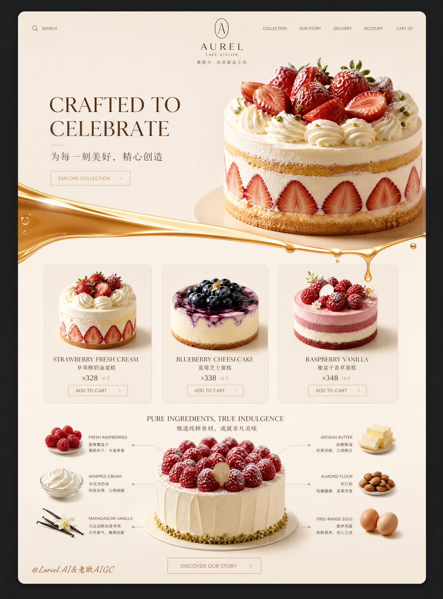
甜品商品详情页布局
提示词 Prompt
电商详情页-4™️Don’t fill the dessert details page with SKUs right from the start: First, let one featured dessert convey the feeling that “it’s worth celebrating,” then present the options and build trust with users separately. 甜品详情页别一上来就摆满 SKU:先让一款主甜点承载“值得庆祝”的情绪,再把选择和信任拆开给用户。 ★ hero dessert on an elegant serving base, restrained props 首屏只推一款高完成度甜点,巧克力、坚果、碎屑只做陪衬。先让用户产生“我想拥有它”的感觉。 ★ image-left, craft-story-right 第二段用小甜点的质感图配合简短品牌故事,把手作、批次和原料讲得更可信;文字不抢产品画面。 ★ three featured dessert cards, aligned price and CTA 精选三款负责降低选择难度。统一裁切、价格和按钮位置,用户更容易快速挑中一款。 ★ category icons → structured product grid 先用品类图标帮助用户定位,再进入完整商品网格。浏览路径清楚,SKU 多也不会显得杂乱。 甜品页的好节奏是:先被一款打动,再理解品牌,接着轻松挑选,最后看到完整系列。
采集收录,未经本平台逐条出图验证;原文与效果图来自所标注来源。提示词保留原文。