 ×1 / 1

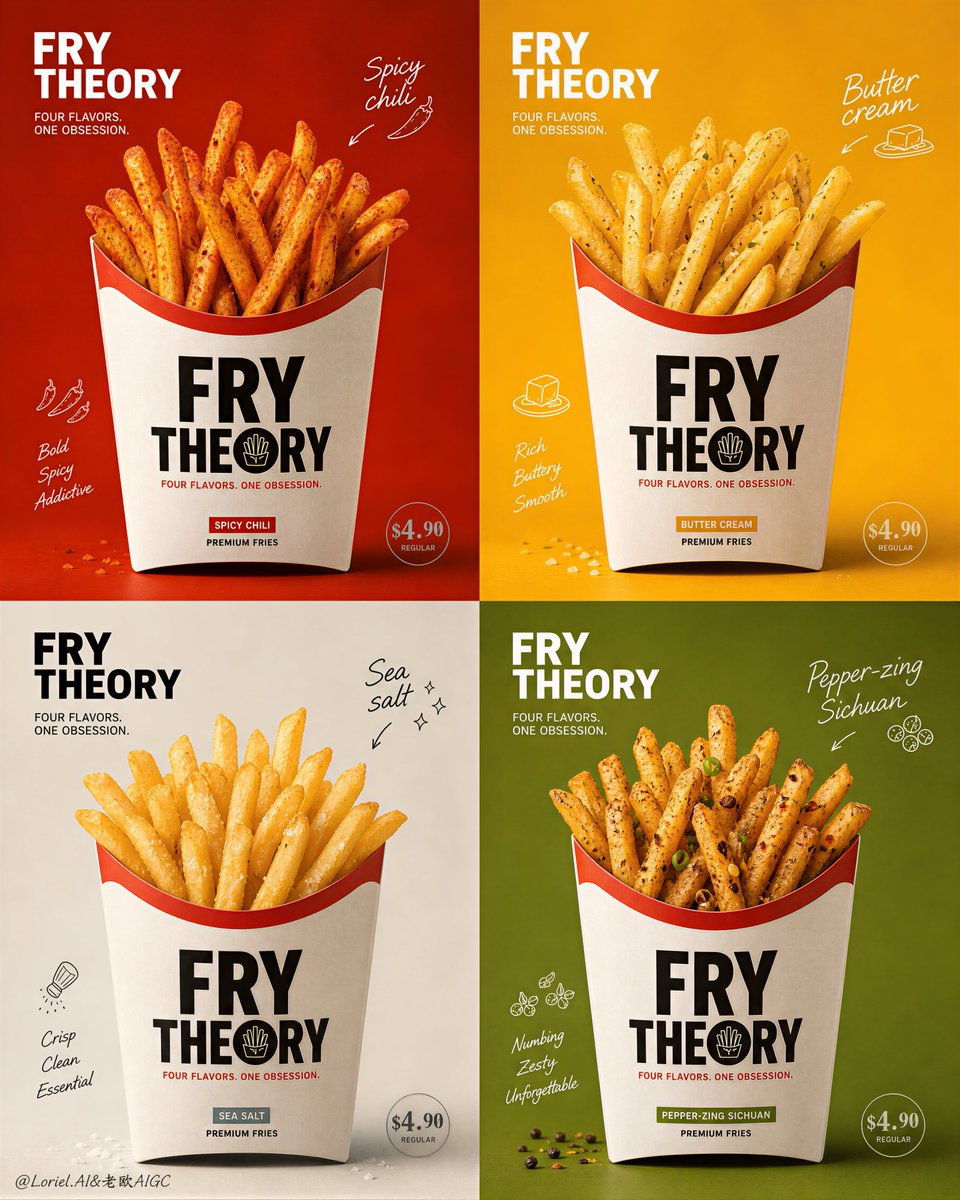
四格四口味高级薯条海报
Prompt Prompt
🍟To make the French fry flavor series look professional, the key isn’t to change the design for each compartment, but rather to “keep the packaging consistent while letting the colors and seasonings speak for each flavor.” * identical bag size, placement and print hierarchy 四格纸袋必须同尺寸、同机位、同 Logo 和同价格位置;结构越稳定,系列感越强。 * one bold flavor color block, matching seasoning texture 辣味用红橙与干辣椒粉,黄油用金黄与细腻粉感,海盐用矿物白与晶体颗粒,花椒用绿金与细小香料;背景和薯条表面一起说出口味。 * crisp rough edges, natural seasoning adhesion 薯条要有粗糙脆边、轻微油光与真实调味附着;别做成光滑塑料感,食欲才成立。 GPT- image 2 prompt👇 Create an ultra-premium 2x2 four-panel promotional poster for a fictional fries brand called FRY THEORY, combining the extreme texture enhancement of Milk Cloud Orbit with the tighter visual-system discipline of Cream Halo Transit, while pushing the overall design away from ordinary fast-food promotion and toward a more fashion-forward, brand-led campaign aesthetic. The poster must present four flavor variants of premium fries: spicy, butter cream, sea salt, and pepper-zing Sichuan style. The final image must feel bold, clean, graphic, collectible, and highly craveable, with stronger color-block impact, sharper packaging language, more unified brand structure, and less cheap promotional feeling. Use English-first branding, refined minimal pricing, elegant hand-drawn micro-graphics, and premium editorial packaging logic. Core layout: Use a strict 2x2 grid with four equally sized panels. In every panel, one full fries paper bag must appear in exactly the same size, exactly the same frontal position, exactly the same height, exactly the same camera angle, and exactly the same framing logic. All four bags must be fully visible, never cropped, with perfect product-series consistency. The layout must feel highly controlled and premium, like a world-class brand campaign rather than a casual food ad. Brand direction: This version must reduce ordinary sales-poster feeling and strengthen the sense of a premium global fries brand. The image should feel more like a seasonal flagship campaign from a stylish contemporary food label. Push stronger color-block impact, cleaner packaging graphics, more disciplined typography placement, and more sophisticated negative space. The result should feel graphic, modern, and brand-dominant, not noisy, not bargain-driven. Packaging system: Design one unified premium fries bag system used across all four panels. The bag must have identical proportions, identical opening shape, identical print structure, identical logo placement, identical visual hierarchy, and identical material realism in every panel. The bag graphics should be bolder and more refined than before, using stronger graphic blocks, cleaner brand marks, and sharper packaging language. The packaging must feel memorable and fashionable, like collectible branded takeaway design. Typography and pricing: Use English-first branding with a powerful but refined main title such as “FRY THEORY” and a clean supporting line such as “FOUR FLAVORS. ONE OBSESSION.” Add minimal price marks for each flavor, using exactly the same style and placement logic across all four panels. Typography must feel stylish, graphic, and intentional, with no crude bold fast-food look. The title, flavor names, and price markers should feel like part of a mature visual identity system. Flavor structure: The four flavors are: 1. Spicy chili fries 2. Butter cream fries 3. Sea salt fries 4. Pepper-zing Sichuan fries Each panel must remain structurally identical, but the flavor identity should come through via seasoning color, garnish logic, panel color, and tiny annotation accents. The fries must still dominate every panel. Milk Cloud Orbit enhancement: Push texture realism much further. Every fry must show crisp rough edges, fine blistered potato skin texture, believable seasoning adhesion, subtle oil sheen, and a hot fresh-from-fryer finish. Chili powder must feel dry and aromatic, butter cream must feel silky and rich without heaviness, sea salt crystals must feel sharp and mineral, and Sichuan pepper dust must feel fine, fragrant, and premium. Paper fibers, seasoning particles, and tiny crumbs must all carry collector-grade detail. Cream Halo Transit refinement: Tighten the whole campaign system. Unify all price positions, flavor-name positions, doodle placements, and supporting annotation logic across the four panels. Every panel should feel different in flavor, but identical in design discipline. The visual rhythm across the 2x2 grid must feel like a polished brand family, not four separate posters assembled together. Color-block direction: Push stronger saturated color-block backgrounds behind each bag, with each panel using one dominant bold color field that feels premium and graphic rather than playful-cheap. Suggested palette direction: Spicy chili: deep red-orange Butter cream: warm butter gold Sea salt: pale mineral cream or cool stone off-white Pepper-zing Sichuan: muted electric green-gold The colors must create strong visual impact while still feeling coordinated as one series. Hand-drawn micro-graphics: Add only a small number of refined hand-drawn accent graphics around each bag: arrows, micro flavor notes, tiny spice marks, salt spark icons, small fry-themed scribbles, or minimal playful motion lines. These must feel curated and stylish, never childish, messy, or overloaded. They should support the packaging and color blocks, not compete with them. Lighting: Use soft premium commercial lighting with consistent frontal and upper-side shaping across all four panels. The fries must glow warmly and remain the hero in every quadrant. Shadows should be controlled, soft, and elegant. The light must reveal texture, seasoning, paper-bag form, and product freshness with high-end polish. Material realism: Push all surfaces to maximum realism. Fries must feel hot, crisp, fluffy inside, and richly textured. Seasoning powders must cling naturally. Butter cream must feel smooth and luxurious. Sea salt must sparkle subtly. Sichuan pepper particles must feel fine and dry. The paper bag must feel tactile, matte, structured, and premium. Preserve immaculate detail without greasy mess. Mood: graphic premium branding, craveable product realism, fashion-forward food campaign, bold color-block impact, collectible fries poster, stylish contemporary fast-casual luxury, mature packaging identity Rendering style: ultra-premium food branding poster, 2x2 four-panel fries campaign, identical centered paper bags, Milk Cloud Orbit texture enhancement, Cream Halo Transit system refinement, stronger color-block impact, sharper packaging graphics, minimal refined pricing, elegant doodle accents, soft high-end commercial lighting, editorial brand-campaign aesthetic, 8k Negative prompt: cropped bags, inconsistent bag size, inconsistent bag position, cheap promotion feeling, discount flyer styling, cluttered layout, crude bold fonts, weak packaging graphics, low-detail fries, greasy mess, childish doodles, flat lighting, plastic-looking food, cartoon styling, low-resolution texture, distorted packaging, weak flavor separation
采集收录,未经本平台逐条出图验证;原文与效果图来自所标注来源。提示词保留原文。