 ×1 / 1

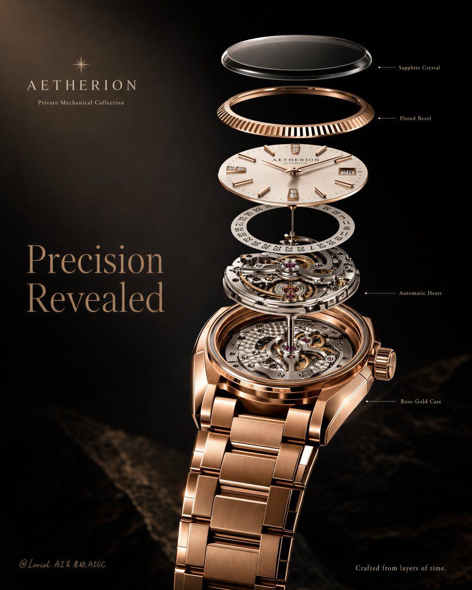
爆炸图高级腕表海报
Prompt Prompt
The exploded view works because it feels assembled, not scattered. 🧊 floating components aligned on one precise central axis above the watch This keeps the reveal luxurious instead of technical-looking. You see each layer rise from the same object, so the watch still feels like one complete piece, not a parts diagram. ✨ evenly spaced layers: sapphire crystal, fluted bezel, dial, date layer, movement, case This gives the eye a clean vertical rhythm. The poster moves from surface to mechanism to rose-gold body, making the craftsmanship feel calm, legible, and expensive. GPT- image 2 prompt👇 Create a premium vertical luxury watch campaign poster for a fictional haute horlogerie brand called AETHERION, combining Transit-style editorial restraint with Orbit-style layered reveal. Feature one flagship rose-gold mechanical wristwatch as the absolute visual hero, presented in a refined exploded-view composition against a dark cinematic studio background. The image must feel ultra-luxurious, technically precise, and globally flagship-level. Core composition: Place the complete rose-gold wristwatch slightly right of center in a three-quarter front view, with the bracelet descending naturally and the opened case exposing the mechanical movement. Above the watch, suspend a clean vertical exploded stack of key components on one precise central axis: sapphire crystal, fluted bezel, dial plate, date layer, and selected movement layers. The floating components must align perfectly and feel as if they are unfolding upward from the finished watch in a calm, elegant sequence. The composition should read instantly as one premium object being revealed layer by layer. Transit restraint: Keep the layout highly controlled and minimal. Use a deep charcoal-to-black gradient background with large negative space, especially on the left and upper-left. Reduce text to only the essential brand hierarchy and a few tiny technical labels. Avoid infographic clutter, excessive callouts, or busy decoration. The final image should feel like an international flagship watch poster, not a product manual. Orbit motion: Strengthen the visual flow through the exploded layers. The floating parts should rise upward in a graceful, evenly spaced sequence, creating a subtle sense of vertical momentum and revelation. Light reflections, component spacing, dial geometry, and bracelet direction should guide the eye smoothly from the upper floating parts down into the complete watch body. The image should feel like precision is unfolding in motion, elegant and controlled rather than dramatic or chaotic. Watch design: A museum-grade automatic mechanical wristwatch in polished rose gold with a luxurious integrated or semi-integrated metal bracelet, a champagne-silver dial, slim baton hour markers or refined diamond-set indices, a date window, visible crown texture, and a highly detailed movement inside the opened case. The watch must feel contemporary yet timeless, engineered yet emotional, with flawless proportions and premium finishing. Exploded-view logic: Include only the most important layers: sapphire crystal, fluted bezel ring, dial surface, calendar/date layer, visible movement module, and rose-gold case body. Each component must remain physically believable, properly scaled, and capable of reassembling perfectly into the complete watch. The exploded spacing should be elegant, symmetrical, and luxurious, with no messy engineering chaos. Lighting: Use cinematic studio lighting with a soft but focused key light from upper left, gentle frontal fill, and refined rim highlights on the rose-gold case, bracelet edges, crystal, and mechanical parts. The metal should glow warmly against the dark background, while the movement receives crisp micro-highlights that reveal craftsmanship and depth. Maintain strong contrast without muddy blacks or blown reflections. Material rendering: Ultra-real polished rose gold with controlled specular roll-off, brushed internal metal surfaces, transparent sapphire crystal with subtle edge refraction, detailed gears, bridges, screws, jewel bearings, engraved dial details, and articulated bracelet links with natural shadow gaps. Every surface must feel tactile, expensive, and physically correct. Typography and branding: Use only minimal original English typography. At the upper-left, place: “AETHERION” “Private Mechanical Collection” Main headline: “Precision Revealed” Add only 3 or 4 tiny technical labels near key components, such as: “Sapphire Crystal” “Fluted Bezel” “Automatic Heart” “Rose-Gold Case” At the bottom-right or lower area, add one short restrained line: “Crafted from layers of time.” Typography should be subtle, elegant, and clearly secondary to the watch. Color system: Deep charcoal-black background, warm rose-gold metal, champagne-silver dial tones, steel-grey inner mechanics, ruby-red jewel bearings, and soft champagne or light-grey typography. The palette must feel luxurious, technical, and tightly controlled. Style: Cannes-level luxury watch campaign, haute horlogerie editorial advertising, technical beauty storytelling, premium product hero image, exploded-view elegance, globally marketable, collectible, and ultra-refined. Negative prompt: copied original text, copied original brand name, cheap infographic layout, messy exploded view, warped watch case, distorted bracelet, fake CGI gold, plastic metal, unreadable dial, cluttered callouts, low-detail gears, oversharpened reflections, muddy shadows, flat lighting, low-end catalog style, watermark, random icons
采集收录,未经本平台逐条出图验证;原文与效果图来自所标注来源。提示词保留原文。